
Millwork commons

Please Note:
✅ Millwork Commons is the official name.
❌ “Millworks” or “The Commons” or “MC” should not be used in copy for messaging, posts, press releases, etc.
Logo Files


Logo Structure
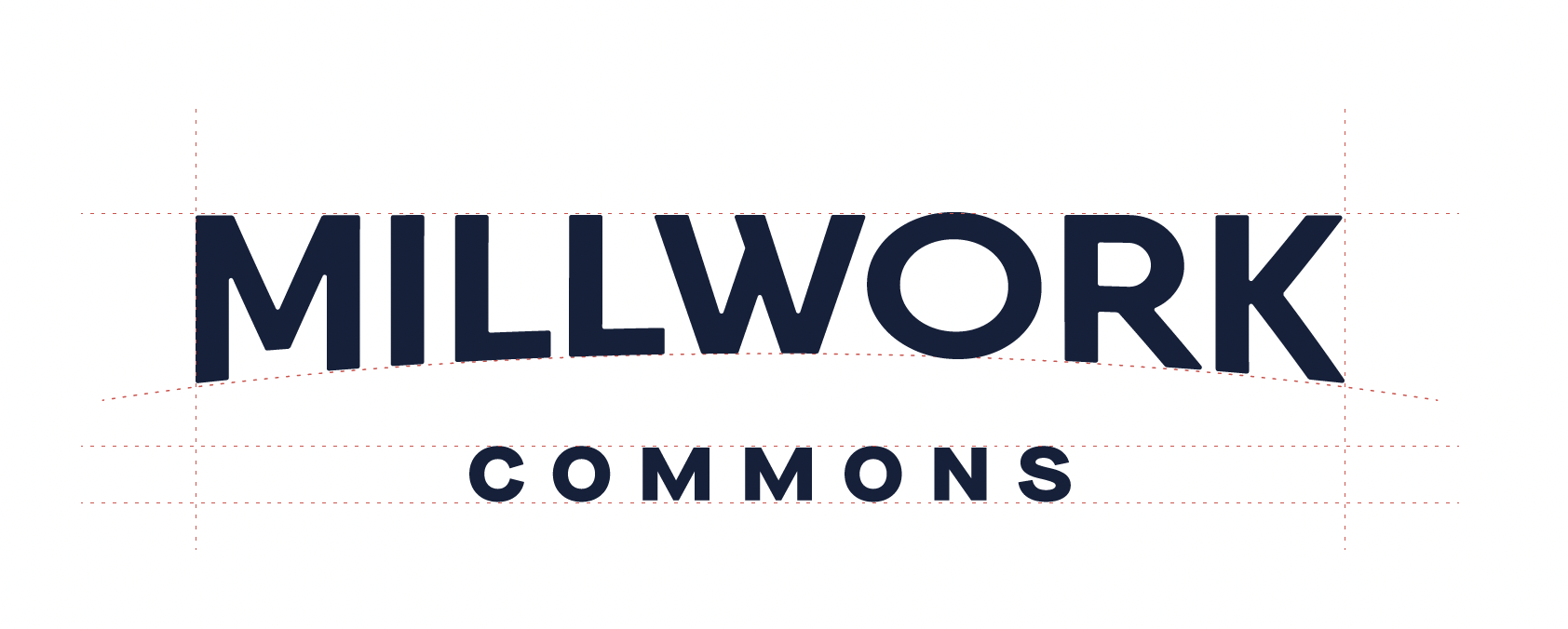
Designed with simplicity and purpose, the typography is center-aligned and has a slight arch applied to the Millwork name, creating a unique and visually appealing word mark.
Logo Spacing
The primary logo is a horizontal lockup of Millwork’s mark and logotype. To ensure the logo stands on its own, please leave at least one “M’s” worth of space around it.

Millwork “M” Icon
The Millwork Icon consists of the first letter of the logo with a refined curve to mirror the full Millwork logo.

Water Tower

Sub Brands
Each sub brand consists of an icon overlaying a consistent map graphic paired with a word mark. The word mark is two lines with “Millwork” in navy on line one and the sub brand in its assigned primary color on line two. The sub brands each have a designated color palette to use with digital and print collateral.

Typefaces

Colors
Add Variety
Color adds life and vibrancy, providing opportunities for variety and thinking outside the box.
Take liberties. Be expressive.
Surroundings
Apply the brand meaningfully with surroundings and context.
Stay true to a brand but respect the environment it’s paired with.
Color Theory
Combine and pair colors to broaden brand application…but do it reasonably.
Some colors just don’t work together; practice good color theory.

NAVY
RGB:
19 32 61
CMYK:
98 86 45 52
HEX:
#13203D

PURPLE
RGB:
49 47 94
CMYK:
93 92 32 23
HEX:
#312F5E

PINK
RGB:
210 88 123
CMYK:
4 85 28 0
HEX:
#D2587B

ORANGE
RGB:
204 93 54
CMYK:
8 81 100 1
HEX:
#CC5D36

YELLOW
RGB:
245 206 91
CMYK:
1 17 81 0
HEX:
#F5CE5B

GREEN
RGB:
165 197 83
CMYK:
4 2 100 0
HEX:
#A5C553
Brand Application
Angled Color Bar
An updated interpretation of the Millwork color bar used to complement the Millwork logo and reflect the brand in the absence of the logo. The logo should not be placed on top of the color bar or patterns

Custom Requests
If you have a custom request or need help with Millwork Commons brand elements,
we're happy to help. Send requests to info@SecretPenguin.